LawDepot Members Homepage
Page Redesign
Project Overview
Company
LawDepot is a Canadian company that creates customized online legal forms. They provide quick and easy legal solutions for users across 14 different countries including the US, Canada, and Germany.
Problem Statement
In moderated sessions with our users, we discovered users weren't using the Member's Homepage as a place to access recent documents and start new ones. Instead, they were immediately navigating to the 'My documents' page. How can we improve the interface so that we are providing more value to our users and better align to their needs?
My Role
- Iterative ideation, wireframes, mockups, and prototypes for testing
- Reviewing moderated sessions and unmoderated testing results
- Defining user goals/needs
- Development review
- Country expansion and post-experiment refinements
Tools Used
- Figma
- Useberry (user testing)
Summary
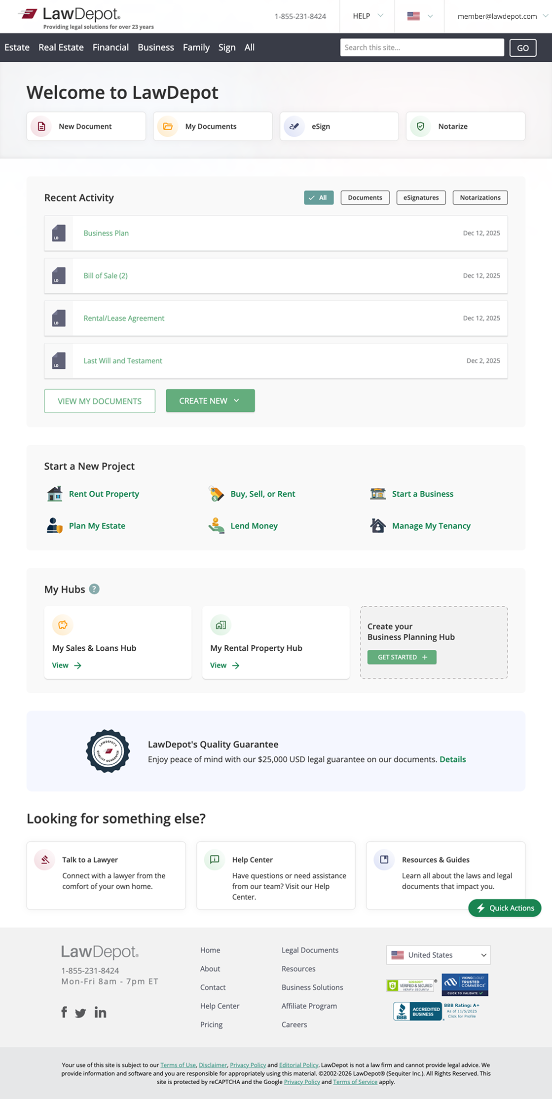
LawDepot users weren't gaining value from the current design of the Members Homepage. To solve this, we decided to turn the page into more of a dashboard that would allow users to quickly navigate to the documents and working sessions they cared about. This included adding an entry point to access to their 'Hubs', something that was only accessible through the main navigation bar before. The redesign also included action buttons at the top that aligned with our user’s main goals. With the added features and modernized look, user’s task completion time was also decreased significantly. User's satisfaction can also be seen in the company's increased revenue since this update increased the annual revenue by six figures(and more with expansion to other countries).
Final Design
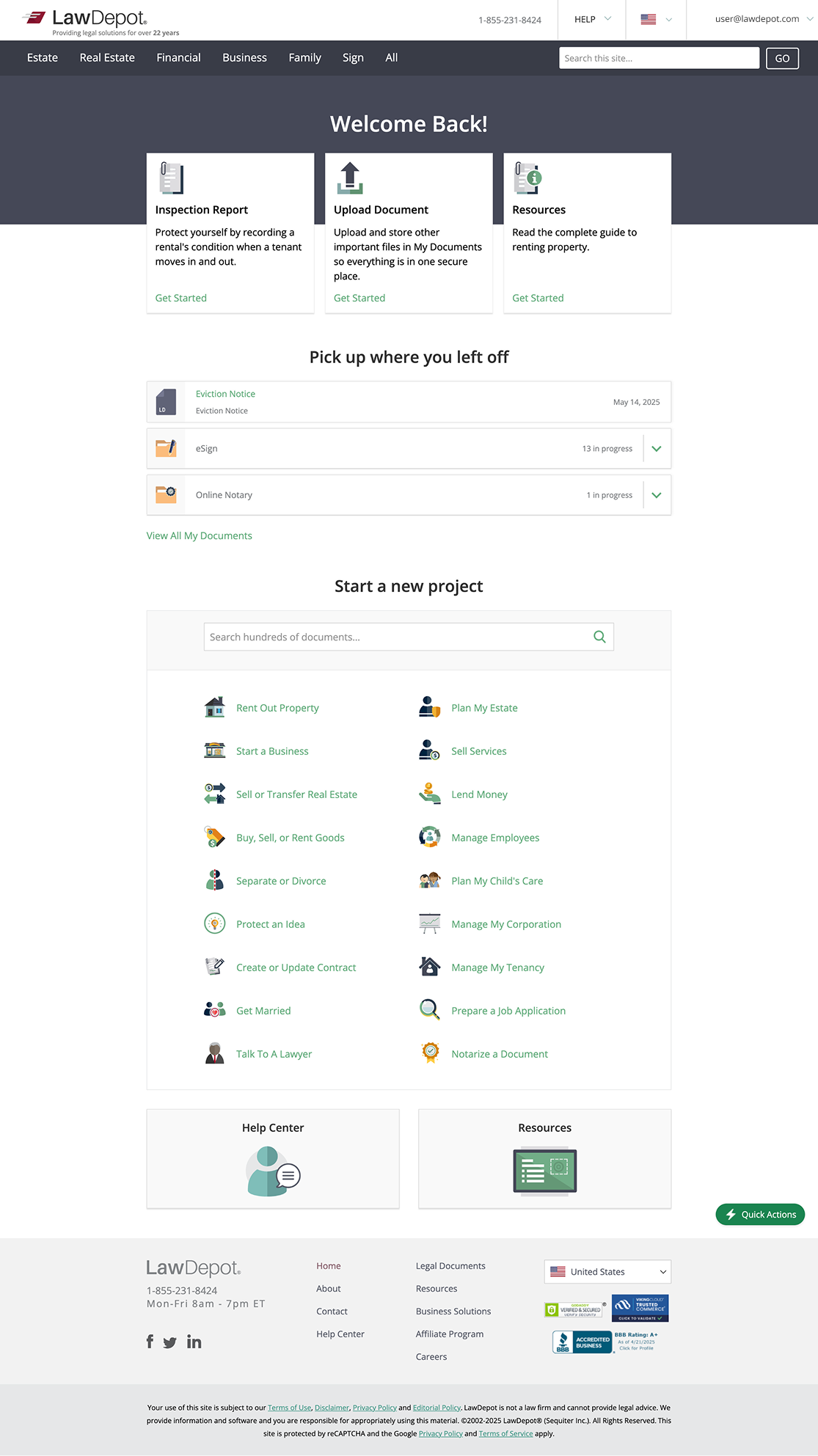
Before Redesign